Are you looking for the best fonts for elementary school students to enhance their learning experience? Discover how the right font can improve readability and engagement in educational materials for young learners.
Fonts play an essential role in children’s learning experience, particularly in elementary school. The right font not only makes reading easier but also helps children improve their handwriting and literacy skills. In this article, we’ll explore the best fonts recommended for elementary students, why these fonts are ideal for young learners, and how they can enhance their educational journey.
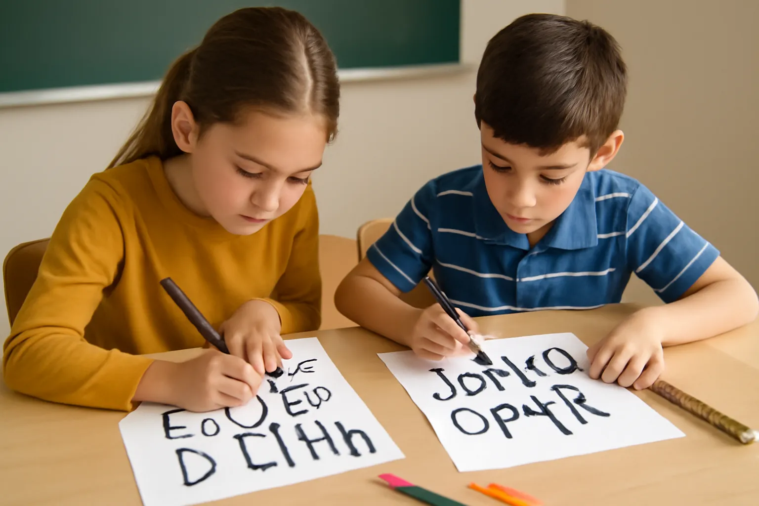
Recommended Fonts for Elementary School Students
When it comes to selecting fonts for elementary school students, readability and simplicity are key. Fonts that are easy to recognize and read help students learn how to form letters and understand words more easily. Among the most popular fonts for elementary school students are Comic Sans, Century Gothic, and Verdana.
-
Comic Sans Although often criticized in design circles, Comic Sans remains a popular font for young learners. Its rounded, informal appearance makes it easier for children to recognize letters, making it a go-to choice for early education.
-
Century Gothic Known for its clean, sans-serif design, Century Gothic is an excellent option for students learning to read and write. Its simple, geometric letterforms make it highly legible, helping children focus on the words rather than the difficulty of deciphering them.
-
Verdana Another widely used sans-serif font, Verdana offers wide spacing and clear, simple characters that make it easier for young readers to distinguish each letter. Its open design reduces visual clutter, promoting better reading habits.
The primary goal with these fonts is to ensure that they are legible and comfortable for children. For example, Comic Sans works well because it uses exaggerated letterforms that help young students distinguish between similar letters like “b” and “d”.
Why are these fonts recommended? These fonts emphasize clarity and easy-to-read characteristics, crucial for children learning to read and write. They also have wider spacing between letters, reducing the chances of confusion.
👉 Learn more about effective fonts for children👈
Elementary School Font Font: Why Font Choices Matter
When selecting fonts for learning materials or classroom projects, it’s essential to consider how the font impacts the student’s ability to grasp concepts and retain information. Fonts like School Script and D’Nealian are often used in elementary schools due to their connection to handwriting instruction.
-
School Script A font designed specifically for young learners, School Script mimics the style of cursive handwriting. It provides a transition from print to cursive, helping students develop their handwriting skills early on.
-
D’Nealian This font was developed for students learning cursive writing. It offers a rounded form that makes the transition from print to cursive easier, which is essential in early elementary education.
Fonts designed for early handwriting instruction often follow a more structured approach, encouraging proper letter formation. The goal is to make learning to write as intuitive and enjoyable as possible, while maintaining a smooth progression towards more advanced handwriting styles.
Why do these fonts matter for elementary school students? The fonts chosen for early education provide foundational skills for students, helping them transition from learning to read and write in print to more advanced skills like cursive writing.
👉 Discover more educational fonts for kids👈
Elementary School Student Fonts: Encouraging Engagement and Development
The font choice can significantly impact a child’s engagement with learning materials. When selecting a font for assignments, projects, or digital resources, fonts such as Arial, Tahoma, and Georgia are effective in promoting clarity and visual appeal.
-
Arial A commonly used sans-serif font, Arial is favored for its simplicity and ease of reading. It’s a clean and modern choice that looks neat on both printed and digital materials.
-
Tahoma This font has wider spacing between letters, which improves legibility and reduces visual stress. Its modern appearance also aligns well with younger learners’ need for simplicity.
-
Georgia A serif font known for its large size and high readability, Georgia is a good choice for print-based materials in the classroom. It helps students easily distinguish between letters, which is particularly useful for those just starting to read.
These fonts are more than just aesthetically pleasing; they are essential tools in helping elementary students engage with their studies. The use of clear and legible fonts can also reduce reading fatigue, allowing students to focus more on the content rather than struggling with the appearance of the text.
Why should teachers and parents focus on fonts for elementary school students? The fonts used in materials influence how students approach learning. The right font can encourage better focus, boost confidence, and enhance a student’s overall learning experience.
👉 See more tips on engaging students with the right fonts👈
Conclusion
Choosing the right font for elementary school students is more than just an aesthetic choice; it directly impacts their learning experience. Fonts like Comic Sans, Century Gothic, and Verdana make reading easier, while School Script and D’Nealian help with handwriting development. By selecting the appropriate fonts, teachers and parents can significantly improve the readability and engagement of educational materials. Remember, the goal is to enhance readability, reduce frustration, and make learning a fun, enjoyable process.
As the famous designer Susan Kare once said, “Typography is the craft of endowing human language with a durable visual form.” Choosing the right font is an important step in making learning accessible, fun, and effective for young learners.